It was a Sunday after WordCamp in 2011 that the three of us sat down to breakfast.
The dining room of the Parc 55 hotel was calm and sleepy, yet the conversation over coffee and eggs was anything but.
As sunlight poured in through the large picture windows, it was as if we were receiving a revelation that would set into motion one of the most ambitious changes in the StudioPress philosophy since the Genesis Framework for WordPress was conceived and created.
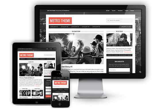
It was the beginning of the movement to transform all of our themes to respond to mobile devices.
(You can insert the inspirational soundtrack of your choice here, if you want.)
OK, I realize that sitting here in 2013, that might not sound like such a big deal.
Mobile responsive design has gone from being an idea to a philosophy and process that just about every serious web developer has embraced.
But back in August of 2011, the idea of building a single website that would automatically adapt to all devices was still in its infancy. In fact the mobile responsive design poster-child — BostonGlobe.com — hadn’t even been released to the public.
It was a risky move to devote a large amount of resources and energy to something that could have been a passing fad.
The new normal
But of course it didn’t pass and it wasn’t a fad. Mobile responsive design continues to charge forward stronger than ever.
In fact, Mashable has called 2013 “The Year of Responsive Web Design.”
Yet, for all its accolades — and despite the backing of industry heavyweights — there are some who remain unconvinced that mobile responsive design is the way to go. These folks argue that your website should have a completely separate mobile presence.
I think differently. I want you to believe in mobile responsive design. I want you to embrace it like the internet has embraced funny cats. I want to give to you three reasons why you should choose a mobile responsive website design over a separate mobile site.
1. Mobile responsive design is better for SEO
Writers and web developers know that when Google suggests a certain course of action, it’s usually a smart idea to follow if you care about search rankings.
In an attempt to bring clarity to web developers, Google has specifically said that responsive design “is Google’s recommended configuration.” I’m not really sure what other arguments I need to make at this point, but for the stubborn we’ll press on.
If you employ responsive design, you’ll have more equity in your back-links.
There have been a number of times I’ve wanted to share a link from my phone, but when copying and pasting that link in an email, Twitter, or Facebook, the link copied is the link to the mobile site. Everyone that clicks on this link in full size browser is going to be taken to the mobile site, and if they’re not redirected, they’re treated to content that looks horrible and is not optimized for their screen.
Nobody wants to see a mobile site on their desktop, so they bounce. If you design your site responsively, every link that’s shared is a link to your full site and mobile site. There is no confusion or crossover between the two.
… a single URL for the content helps Google’s algorithms assign the indexing properties for the content.
For a mobile site (actually for every site), SEO and user experience are blood brothers. If your site is unpleasant to use and the user can’t find what they’re looking for, they’ll make a quick exit.
This causes your bounce rate to grow, which tells Google your site probably doesn’t have what that person was searching for. Congratulations, you’ve just been knocked down in the rankings for the term that user searched for.
This can be avoided by having a mobile site that looks great and functions extremely well … and has all the content of your full size browser version.
For all that is good and right, please do not use a plugin that “converts” your site to a mobile site. There was a time and place for that, but that time has passed. There are few things in this world more ugly and jarring than visiting a site on my phone and having it redirect to the bland mobile version.
Lastly, we all know that load time is a factor when Google ranks sites. When your site has to re-direct to a mobile url, this increases the load time. A responsive site has no such redirection.
2. Mobile responsive design is easier to maintain
For sites that create a lot of content, it can be a real headache to make sure that all of it is transferred properly to multiple web properties.
Ultimately, you have to spend more time, or you’re paying someone else to spend time copying and formatting content to multiple places. If your site is designed responsively, when you’re finished creating content, you’re finished.
With a responsive design, your site is also future-proof. Many mobile-only sites have to be constantly tweaked when a popular new device comes on the market. Mobile responsive design ensures that your site will be optimized … no matter what the screen size of the device.
3. Mobile responsive design delivers a better reading experience
There are some that will argue this is dead wrong, but if you develop with a mobile first philosophy, their argument goes out the window.
Some content producers think they should curate content by device — only publishing the content that they believe appeals to mobile users, or removing content that’s not “important” enough for mobile. This is a mistake.
Brad Frost, a leading voice in the mobile responsive movement, says:
Mobile users will do anything & everything that desktop users will do provided it’s presented in a usable way. Assuming people on mobile “won’t do that” is a losing proposition. Don’t penalize users with missing content & features just because they are on a full screen.
To be fair, there’s one thing mobile sites have that responsive sites don’t … the “view full site” link.
The reason this link exists is because of the inherent problems with a mobile site. Users want all the content, presented in a way that’s accessible.
The reality of the situation …
If you’re not designing and developing your entire site with mobile users in mind, it doesn’t really matter if you employ a responsive design, or have a separate mobile site.
Data consistently show that mobile devices, mobile usage, and mobile purchases continue to rise at an enormous rate. This data also suggests that this trend will not slow down in the future, but only pick up speed.
To be successful on the web you must begin your process with a philosophy that puts mobile first.
Mobile responsive design is then the natural outflow of this process.
Reader Comments (57)
Why would anyone not use a mobile responsive theme? When choosing themes on WP, if they don’t format on mobile devices I don’t even consider them. Soon I might even upgrade to a paid theme for my site http://www.danerickson.net.
Hi Dan. Actually there is one very legitimate reason for not using a mobile responsive theme. That is, if someone already has a well-established and/or large and/or complex website, they might not want to invest the time, money and energy to re-create their entire site using a mobile responsive theme. In that case, a separate, dedicated mobile site is the better solution. I’ve done both for clients, and in my experience it really depends on each unique situation on whether or not a mobile responsive theme is the best solution.
Excellent post with links to worthy resources.. In my opinion, the key is to ensure that your site is accessible, easy to navigate and the key components available. Text based phone number for click to call and no flash navigation. Since real estate is limited, make sure that your unique selling points stand out in the format. SEO benefits alone make responsive design the approach that is most likely to yield online marketing ROI. Thanks for sharing.
Rick you’re exactly right and that is part of what makes a “mobile first” philosophy the way to go.
We re-launched steripen.com 5 weeks ago using a new responsive design and overall the audience has responded very well. Many of the responsive templates you can buy right now for apps such as WordPress or in our case Magento, do a great job of creating a seamless experience with the exception of the homepage slider regions (for those sites that have such elements). Most of the templates don’t display the text of the sliders leaving the mobile user to wonder exactly the point of each slider image is. This can be tweaked using custom css but so far is not addressed “out of the box.” Just 2cents.
Good stuff. I’m still preparing myself to move my blog from Squarespace 5 to Squarespace 6 (with its responsive design) but already I generally prefer mobile sites given they are less fancy and less distracting.
Dennis, I think you’re going to see that change in the next couple years as people embrace a “mobile first” philosophy. Sites won’t be as cluttered initially because people will understand that most users are seeing it first on their mobile device.
We have seen a significant increase in traffic from mobile devices recently, so definitely responsive design is the way to go for future web development, specially from SEO point of view. It was recently reported in Mashable that tumblr’s mobile traffic may outgrow desktop this year. This means that there will be more people finding and sharing content through mobile phones.
Thanks for shedding some light on this confusing topic, Josh. I’ve been attempting to get my own sites up to speed and also advise clients. It’s still pretty confusing, but this post really helps!
My pleasure Mia!
I think one of the most helpful resources for me was Luke Wroblewski’s book “Mobile First.” That’s what I recommend to anyone wanting to know more.
Responsive design is definitely the way forward as half of website visits will come from mobile devices rather than desktops or laptops in 2013. We’ve also been doing our own research into responsive design, feel free to have a read of our blog http://www.thefinishingpost.com/blog/77.
Thanks for sharing your thoughts.
Emily
Earlier I used a non-responsive WordPress theme and now I changed it to a responsive one and it was great, some increase in mobile visitors.
It’s only a guess but you’re an urban dweller…? So many of us aren’t and don’t have the capability nor the inclination to speed through life. In our valley, and in a LOT of our region, there isn’t fast i-net much less broad band or mobile…except for tractors and trucks. That’s how we like it. and are doing just fine, going at our slow, but steady, rate through life, using dial up or sat link. When folks start complaining about how “busy” they are and life in the fast lane, I just shake my head and don’t feel sorry for them, knowing it’s all due to choice.
If that works for you and your audience, that’s excellent. But most of the web, including many rural dwellers, are using mobile much more than laptop/desktop.
@Sandra Ha! Nope I live in small town in Iowa with plans to move further into the country 🙂
Like Sonia said you need to gauge your audience but even here the majority of people are accessing the web from the mobile devices first because its what they have with them the majority of the time.
Great post!
I’ve been building all client projects to be fully mobile responsive this year, and it’s so much nicer than seeing them use a plugin to do the job 😉
Josh, why not just create a mobil app instead so that viewers can…
1) See a splash page to download the app
2) Redirected to the app store so that I can download it
3) Wait for eternity to download the 40MB file
4) Determine if I want to be spammed by their Push notification request
5) Launch the app and try to find the one page you wanted to read anyway
6) Get an update every week to the app you only used once so that you are sucking up bandwidth resources needlessly.
On second thought…maybe just having a page load when I click on a link so I can read it on my phone or tablet sounds much better.
Sean that sounds fun and all but ain’t nobody got time for that.
You make it sound so inviting, Sean. 🙂
I’m trying to download my 40MB file right now. Be right back………
Mobile websites are the future. Even Google has already said in their blog post that year 2013 belongs to mobile websites. I’ve been looking for a designer who can do the job for one my tech related blog. Hope I will find the one soon.
Almost half the traffic to my blog comes from mobile devices so a responsive theme is a no-braîner.
At the rate of increase, I think mobile will soon have a 2:1 lead among my readers.
Laughing at Sean Jackson’s comment because its so darn funny.
Crying because i know businesses that do that!
Shaking my head cause this post came a few months late for me, already having plunked dough for a site + mobile version. Will be wiser next round.
Thanks for laying it all out Josh.
Hi Josh, thanks for the great post. I’ve been one of the naysayers when it comes to responsive, in a way. The problem I’ve seen is that some sites that are designed responsively end up looking poor in the desktop version. Fonts and spacing become wonky, and the desktop version ends up looking like it was an afterthought in the responsive design process. This isn’t the case here at Copyblogger, but I’ve seen it on multiple sites. So my question is this: How do you design responsively while not sacrificing desktop views (where, for most of the sites I work on, 85% of the traffic still comes from)? It seems like the answer is doing responsive design well and not just doing responsive design, but I’d like to know how you make sure that all of the views are optimal and people don’t just fall in love with the concept of responsiveness for responsiveness’s sake to the detriment of readers and visitors. Your thoughts?
Hey Joseph,
The wonderful thing about a responsive site is that you can target multiple size and adjust just about everything for that particular screen size. So if a responsive site doesn’t look up to par its not the fact that its responsive its because the time and effort has not been put in to make it nice.
In fact having a responsive site that doesn’t seve the needs of everyone kinda defeats the purpose of having a responsive site. Mobile responsive design is not a silver bullet – it still takes work and again is still very new so there are a lot of things still being worked out but in my opinion its the best solution right now.
Thanks, Josh. This confirms my suspicion which is that the problem is not with responsive design but with poor implementation.
So true. This year I got my first smart phone and got to see what my site looked like on mobile. It was awful! Now I have a good theme that translates to mobile very smoothly.
If you don’t have a smart phone yet and have similarly slow-to-upgrade friends, simply pop down to your cell phone provider’s store and pretend to shop. You’ll know right away whether your site works or not 🙂
If I’d known how easy it was to find a mobile responsive theme, I’d have done it ages ago!
Good post. I’m thinking of making the switch soon!
The web comic XKCD had a comic about this the other day. http://www.xkcd.com/1174/
Thanks Josh! Eye opening post that has convinced me to drop the WPTouch plugin, AND the Thesis Theme and work on my StudioPress install to get up to speed with a responsive theme.
I do agree with your arguments, I hate plugins because they don’t bring out a great user experience as the desktop version of the website, I stick to responsive design, if I can not design and design one, there are so many templates at good price I can customize to my needs. Cheers man.
Many people have not addressed the biggest problem with responsive sites.
People act differently on different platforms.
On a work PC, the clickthrough is often to read a PDF – traditionally A4/letter size and multipage.
The last thing they want is an autoplaying video file which disturbs colleagues and draws attention to them.
On a mobile, however, the opposite is true – headphones on, the video is infinitely preferred to the PDF.
I’ve yet to see a responsive site which allows for both.
This is exactly why we are developing a responsive website prototyping tool Froont! Anyone who would like to sign-up for early acces codes, can do so at http://www.froont.com. The aim is to build a great tool, so any feedback is very welcome!
Couldn’t agree more. Check ResponsiveReady http://www.responsiveready.com – you can instantly see how responsive your site is. You can see how it looks on all popular devices. We would love to hear feedback and comments.
People that aren’t making headway into implementing responsive web design now are fairly foolish. With the amount of tablets, phones and other mobile devices on the market, ignoring that portion of viewers could be detrimental to business.
I’m busy developing a new website for myself which will be fully responsive. The implementation and design of a “mobile first” style of site takes a lot longer but the effort and ROI will be worth it in the end.
I use mobile responsive themes when I can (and I like the new ones from StudioPress). But…
My needs are often different when I’m on my phone. Particularly when it comes to small business websites, I want to know where you are, how to get there, and if you’re open. And your phone number, properly linked so I can dial it on Android just by touching it. It’s challenging to make those obvious on a mobile without making them _too_ obvious on a laptop/desktop. Challenging tradeoffs.
Just talking about this very subject yesterday afternoon, as my sister and I sat outside in the glorious Texas sunshine.
Why in the world would anyone NOT use a responsive website?
Yes, in the past I always made sure my sites had the mobile plugin..but that’s not good enough anymore.
Depending on my website, I get traffic referrals from mobile devices 28-40% of the time!! That’s huge! I’d be crazy not to be absolutely certain that my sites functioned optimally for those folks.
We help a lot of beginner bloggers (often on a strict budget) and I tell them there are even free WP themes that are responsive. So there’s no excuse not to have one.
This posts pointed out extra benefits that I was not aware of. 🙂
~darlene
Great post. I am now developing sites with the iPad as the target, with a view to scaling up to full screen and down to iPhone/Android, so I test on-screen with a small window (in fact two, portrait and landscape).
Of ourse this means keeping each page’s content less cluttered and more focused – which of course is a winning strategy for SEO too.
Does StudioPress offer a mobile plugin?
No, we do not — and the primary reason is that most of our themes are built to display beautifully on mobile devices. We’re working towards all of them, with updates, so we don’t feel a plugin is warranted when the themes themselves look so good.
It is irrefutable to say that mobile design is the way to go, and any website that wants to draw traffic from the users of mobile device, can’t but have to design sites that accommodate these users.
Thank you so much for great article. This article opened my mind for the possibilities.I think Responsive website design might turn out as a great way to progressively enhance even small budget projects for mobile devices.
My pleasure Tony.
Keep in mind – responsive design might not be cheaper on the front end in terms of time invested (especially if you’ve never done it before) but you’ll reap the benefits later and get all that time equity back not to mention all the other benefits I talk about in the article.
Hi Josh,
I appreciate that you’re writing about making sites mobile, as it’s clear that mobile traffic is going to accelerate, and it’s already big. However, as a mobile SEO expert and mobile search columnist for Search Engine Land, I think your first point is misguided.
First, you only cited the first half of Google’s two part recommendation. They clearly say that they prefer responsive web design if it makes sense for the user. If it doesn’t make sense for the user they don’t recommend it, but instead support two other options equally: dynamic serving or separate URLs. And there are many instances where responsive web design does not make sense for the user, as I explained in my most recent Search Engine Land column, “When Responsive Web Design is Bad for SEO”: http://searchengineland.com/when-responsive-web-design-is-bad-for-seo-149109
For example, responsive web design could prevent product innovation that could improve the user experience. Or it could not contain keywords and concepts that are important to mobile searchers, but not desktop searchers. Or it could slow down the site significantly if not done correctly (which many implementations aren’t). Or it could be useless if your audience is one of the almost 50% of the global population that uses a feature phone.
Also, your point about consolidating link equity with one URL is a popular myth. Obviously Google would prefer not to use their resources consolidating link equity, but if separate URLs provide a better user experience then they provide webmasters with the option of consolidating link equity in separate URLs with bidirectional annotations or switchboard tags. These tags also aid Google with skip redirect, so that, like with responsive sites, users aren’t slowed down by a redirect to a separate URL.
Finally, I’m not really sold on the other two points either. As Karen McGrane explains in her book Content Strategy for Mobile, the right content management system can make maintaining separate mobile sites as effortless as responsive sites, as you just have to write the content once and it lives on multiple platforms. And though I know Brad Frost and Karen McGrane do advocate adaptive content and not serving different experiences based on platform, there are some instances when it doesn’t make sense to serve mobile users desktop content, as it’s unusable (e.g. printable coupons, Flash games), and there are some instances where creating mobile-specific content could actually be hugely beneficial for a brand. I give examples in my book review of Content Strategy for Mobile on Marketing Land here if you’re interested: http://marketingland.com/book-review-content-strategy-for-mobile-by-karen-mcgrane-34269
So while I appreciate the effort to get more publishers mobile, and I think in some cases responsive design can be a good solution, the arguments that you presented are largely not convincing.
Bryson, your points are well taken but you must have not read the last section of my article.
When you create with mobile in mind first and progressively enhance to the desktop you get all the benefits of a single url, link equity and the rest. The problem is that most sites today are still created with the desktop in mind first. People need to take off their blinders and realize that is most situations (and soon to be all based on every trend) mobile traffic is trouncing browser traffic and if you’re not designing and developing for mobile first you will lose.
Responsive web sites are not really the issue its whether or not the site was designed and developed with mobile users in mind from the beginning.
If you’re not going to design and develop with a mobile first philosophy I would agree with just about everything you say. But when you combine a mobile first philosophy with responsive design you have a killer combination that is the best of both worlds.
Hi Josh,
Thanks for your response. I did read the last section of the article, and I do agree that mobile first can be a powerful concept for making content mobile. You have to keep in mind, though, that a mobile first philosophy is not for every business. Many site owners are reluctant to embrace a mobile first philosophy because they still get the lion’s share of their revenue from desktop users. Even The Weather Channel, who gets more mobile traffic than most sites will ever dream of, doesn’t see a mobile first philosophy as being realistic for them for another couple of years (http://www.digiday.com/platforms/the-mobile-first-fallacy/).
Besides, even if you made a mobile first responsive site you would still not be able to use different keywords on your mobile site, build specific mobile tools based on the mobile features that aren’t available on desktops and laptops, or appeal to feature phone users, who are very active in emerging markets where they use their mobile phones as their primary Internet access point.
Again, I appreciate that you are evangelizing mobile, as it’s clearly not going away. I also think that responsive design is probably appropriate for the majority of blogs and news sites, of which I imagine your readers are probably mostly concerned with. However, I see a lot of people in the comments questioning why anyone would build anything other than a responsive site, and I wanted to say that there are many good reasons to build a dedicated mobile site, including SEO, which you mentioned as being a reason to go responsive.
Great post.
This is we we made a responsive website http://saundz.com/ for American English Pronunciation Software. The app is coming soon and I would really love some feedback.
Thank you!
Hi Josh,
I agree with your 3 arguments for responsive design, but I have to say that I find this article and others like it extremely frustrating, both as a user and as someone who works in the mobile industry.
I speak to people in the web industry every day, at big organisations, who tell me that they have/are going to launch a responsive site and that it will mean their site is ‘optimised’ for mobile, and frankly, it just depresses me. They believe with such conviction that they are doing the correct thing because the industry says responsive is the way to go.
Flip that round to me. I’m on a bus, trying to access site after big corporation responsive site. My bus route through my city is half an hour long, covering 6 miles (I won’t say where). therea re about two 100m stretches where coverage is tip top. For the rest of the journey the experience is too slow and frustrating to make it practical.
The simple fact is that very few responsive sites come in small enough to make them workable while on the move for most users.
Of your arguments, only the 3rd is for the user. The truth be told – I think responsive is lazy/cheap, for big organisations. It represents an attempt at an ‘easy’ solution, and it doesn’t really think about the users, all in different places and on thousands of different devices.
This article's comments are closed.