This is another addition to our ongoing series of tutorials and case studies on landing pages that work.
Christine Vogensen sells adorable wall art for children’s rooms. While her basic business model is to sell wholesale through sales reps and boutiques, she was hoping to see some action from her retail.
Her original information (submitted to me in 11/08 – thanks for your patience, Christine!) showed that she was generating traffic with PPC, but that she was realized $0 sales. When I called her recently to see if there was any new developments on the sales front, the answer was an unfortunate no. While she no longer uses PPC, she has pumped up her SEO for to strengthen her organic rankings in Google and related linking efforts. She’s worked with consultants to review her competition and price points.
In short, she’s done much of the contextual work I would have suggested. And in a strong economy, that would have generated positive results pretty quickly.
But we don’t have a strong economy and the gift business especially is suffering. Recommendations that might have worked well 12, even 6 months ago aren’t enough to lift the fearful stranglehold folks are keeping on their wallets. Retail or e-tail, visitor traffic is way down and sales are down even further. So today’s makeover will incorporate a variety of recommendations — some specific to the site and some from my own experience as the owner of a 10-year old niche online gift store.
Together, I hope we can give Christine a boost in sales and morale. Let’s review:
- The Goal:
Increase traffic, increase conversions from browsers to buyers - The Problem:
Even with traffic boosters, conversions are nil. - The Current Landing Page:
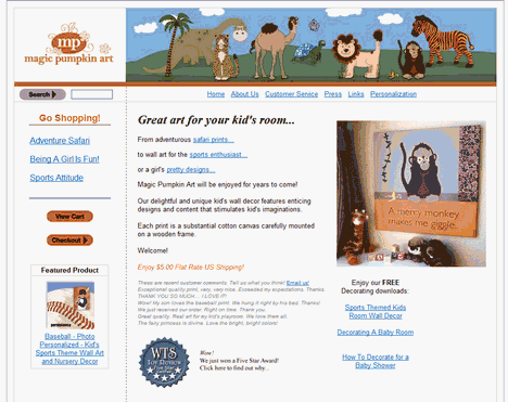
We’ll use this one as the prime example. - Cost:
$35.00 for standard piece
The Maven’s 10-Point Critique
#1 – Find the right emotional hook that would get a first-time mom or grandma to fork over $35 for framed art for baby’s room.
Why do I say first-time? Because as a mom to three, trust me — all the big bucks are generally spent on baby #1. The exception to this rule is when you have 2-3 kids of the same sex and finally you get one of the opposite gender. And this is when economic times are booming and people are spending freely.
Today, when every dollar is a counted dollar, you need to make a strong case as to why YOUR wall art needs to be on baby’s wall. Just charming or adorable won’t be enough. You actually write to this point in your About page where you speak to stimulating imagination and story telling. That’s the kind of intro I’d like to see on the home page. Help your prospect justify the purpose in their mind.
#2 – Push free personalization to the forefront of the sale.
In line with #1, helping customers justify the sale in their heads, when you add that sweet little moniker to the art, all of a sudden it’s more than just an adorable wall hanging. It’s a statement of who that child is/could be in the gift giver’s mind. You can always offer the standard, non-personalized version. But the sale should be made on personalization.
#3 – Revise and expand the merchandise mix to a better balance of boy/girl design themes.
Jungle/sports are traditional boy themes. (The only theme missing for the tiny testosterone set is transportation.) The header graphic is all jungle so I’m already wondering as a visitor if that’s all there is. So, if I’m the mom or mom-to-be of a dainty lassie, I may be thinking there’s simply not enough girly girl stuff for me to look at. I know this is the worst time in the world to add designs, but if you could work with your artists to do just that, I’d strongly consider it.
#4 – Show me some happy babies and children in relation to their happy wall art.
I see art but I don’t see the result of the art. Happy, engaged babies interacting with their moms with the art in the background. Show me playing and story-telling.
#5 – Help parents match colors for the room decor to their choice of wall art.
Do parents buy art and then match the curtains or vice versa? Offer color coordination recommendations, perhaps with swatch-looking graphics that describe the color and/or state the PMS colors (link to Pantone or other similar sorts of color-themed sites.) Perhaps you could partner with complementary websites or a baby bedding entrepreneur who could work up custom comforters, pillows and curtains so that mom can relax knowing everything ‘goes’ in her baby’s digs.
#6 – Don’t put the View Cart and Checkout on the homepage, at least don’t make it so obvious.
This may be the fault of the shopping cart but to make a super bad pun, we’re putting the cart before the sale. Be there, like a smart sales associate, in a quiet corner. I’ll come find you when I’m ready to check out.
#7 – If you guarantee your work, let your visitors know upfront.
Add a nice graphic badge or banner. Make sure it’s visible on every page. Don’t hide the most important piece of getting folks to move to yes – “… but what if I don’t like it?”
#8 – Streamline the product copy but emphasize the specifics of the individual piece.
I’d move all the boilerplate to a single page – About Your Magic Pumpkin Wall Art – and move all the specs here. You can link to it from every product page. Visitors are reviewing several pieces and don’t need to see the same copy over and over again. I’d also add a FAQ from the main navigation about your shipping, returns and other relevant policies.
#9 – Too much “helper” copy the Shopping Cart page.
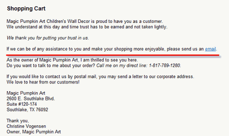
I’m the first one to tell you that visitors need to feel comfortable and confident to proceed with an order. But there’s too much “Thank you, thank you, thank you” on this page. Instead, add a testimonial or two. That will carry a lot more weight when someone is getting ready to commit to a purchase. But do eliminate everything below the red line. Another reason to chop the copy is to bring up the order information. Visitors now have to scroll down to see their complete order which they may or may not do. I’d also brighten, enlarge and even move the order button. It’s barely visible as it now stands.
#10 – Check your links!
There are several broken or incorrect links (the Toy Review badge on the homepage, the policies link under Customer Service points elsewhere.) Also update your copyright line to 2009. While these are all “little things”, it’s these little things that can make a customer hesitate enough to abandon a cart or not even begin the process in the first place.
BONUS RECOMMENDATION
In tough times like now, you want to think of all the possible ways you can repurpose your investment without a lot of expense. In your case, it’s the original art you own. Consider taking your art to a complementary venue and open a Cafepress Store. For very little cost, you can create any number of gifts – one by one – without having to hold any inventory. You might also consider selling your pieces in other art venues like Etsy.com.
My thanks to Christine Vogensen for her surpreme patience and her support of Heifer International. Look for my next makeover in a week or so.
Here’s your chance to be the Copywriting Maven’s next landing page makeover!
Got a landing page that’s more poop than pop? Willing to share with Copyblogger readers? Prepared to put a little of your own “skin in the game” for a Maven Makeover? Then follow your click to Maven’s Landing Page Makeover page for all the details.
(The response to the return of the Copywriting Maven Makeovers has been tremendous – thank you! The downside is I’m booked for new gratis critiques until 6/1/09. If you’re interested in a private critique/makeover or other services, please email me directly.)


Reader Comments (26)
Those are good tips. A good landing page is everything.
Good luck Christine with implementing these improvements which sound fantastic. Particularly, I would love to see more photos of room sets to give an idea of what is possible.
with love, blessings, gratitude
gracefully
Guru Kaur
Great advice. Its the first impression that counts and fixing those little things can realy improve this.
I really like the idea of offering color suggestions for baby rooms. All of the new mothers I meet are so concerned about the aesthetics of their kids’ rooms, from curtains to bedding. This is excellent insight.
Great tips. I have learn something new that can apply to my landing page.
Thanks a lot for great tips.
Yes, an emotional touch always boosts sale.
I learned something new from the link – ‘Maven’s Landing Page Makeover page’.
Mea Culpa! One of you eagle-eyed Maven Makeover fans wrote to tell me that he noted more than usual quota of typos, dropped words in today’s post. (I’m sure almost all of you found them. You just didn’t want to hurt my feelings 🙂
I’m a terrible self-editor and I should have taken my own advice which is READ THE PIECE OUTLOUD to find the errors.
So, my apologies for the appearance of slap-dash. I just don’t type fast or accurately enough to go from brain to keyboard.
Excellent tips. Thanks
I agree with a lot of the advice. I don’t run a gift business, but a lot of these tips are things that I look for when I am buying a gift. Especially personalisation. Most places I go for gifts either let me wrap it, send a card, personalise the card, or do something special.
Excellent tips. Thanks
P.S.: Wanted to say great post!
In the intro, you mentioned that she has “pumped up her SEO.” Ihink she should keep pumping…and look for better SEO guidance. Seeing her TITLE tag with “Home Page” taking up unnecessary room means she’s missing out on organic traffic related to children, gifts, decorating, etc.
@Thomas – excellent point! But most everyone in the gift business, myself included who enjoys (and has enjoyed) stellar rankings for my keyphrases, is suffering this year. That was the pain point I wanted to address. Lack of conversion once folks arrive.
So helpful to have one of your great lessons updated for the economic horribleness.
Thank you as always!
Fascinating stuff. I’m just about to do my own site and a client’s. So this is very timely and helpful. Many thanks, Roberta! 🙂
Great review of her landing page.
LANDING PAGE: should be simple and call attention to your best products. Also, it should tell your visitors what you want them to do (subtly). Thanks for the other great tips!
Fantastic tips!! I love this series and look forward to reading more. I wish Christine much success with her updated site.
The artwork is wonderful. It is warm, inviting, and stimulating. It is however large and I can’t see many people buying more than 1.
I would suggest targeting day care facilities and private schools as well as homes.
For this I would set up a separate page. This artwork would make a great first impression in the reception area. Most parents are very critical when looking at facilities. They look at every detail. Some text along the lines of, ” A picture is worth a 1,000 assurances.”
They may be able to sell multiple pieces by segmenting their campaign this way.
@Keith – that’s a brilliant suggestion!
Great advice. I would say that she needs to ask herself what a customer would ask themselves when they first land on the site: “Am I at the right place?” (make it obvious) and then “What do I click on next?” (send them to your artwork and use google analytics to see if it is working). Once people start to browse the site then your chances of a sale go up a lot.
Thank you for the great tips. Your post will make a great reference for when I am building my own landing pages.
Great advice. Its the first impression that counts and fixing those little things can realy improve this.
I can see some Free giveways to the right hand side. You can use this as a great opportunity to build a targeted mailing list to sell your special promotions later.
You should build an optin box and highlight the offer with an emphasis on FREE.
This article's comments are closed.