Allow your jaw to become unhinged at this statistic:
There are over 1 million more mobile devices activated every day across the world than there are babies born.
Yeah, mind = blown.
Indeed, designing with a mobile-first mindset becomes more important — quite literally — by the day. As does answering burning questions related to mobile design best practices.
For example: Is mobile responsive web design good for SEO or not?
This has become a hotly debated topic, even right here in the Copyblogger comment sections, with reasonable minds making reasonable arguments on both sides.
Depending on where you look and what you read, you might come away thinking that Responsive Web Design is in perfectly fine shape regarding SEO … or that it creates a mess that’s going to destroy your search results.
Is it possible that the real answer is more complex than either of these?
What would Google do?
You might have heard that Google recommends utilizing mobile responsive design on your website. Any article you read touting the SEO benefits of responsive design typically starts here.
This is what Google says on the subject, specifically:
Google recommends webmasters follow the industry best practice of using responsive web design, namely serving the same HTML for all devices and using only CSS media queries to decide the rendering on each device.
One of the oft-cited SEO benefits of responsive design is the ability to present a single URL for a page, rather than a separate mobile URL (e.g. copyblogger.com vs. m.copyblogger.com).
Theoretically, this should help the overall SEO of your site and pages by channeling all present and potential link juice into a single URL, instead of splitting it.
Google’s recommendation above fits this premise.
But that statement from Google is just bullet point #1 of two bullets beneath the heading “Overview of Google’s recommendations.”
Bullet point number two says: “If responsive design is not the best option to serve your users, Google supports having your content being served using different HTML.”
So Google — they of the 67% search market share — recommends responsive web design first, while quickly noting that it’s okay if responsive web design is not used … if there’s a better option for serving your audience.
The bots can handle it, Google assures us, if you choose to offer different sites for desktop and mobile users, separate URLs and all.
As explained by noted responsive web design-for-SEO critic Bryson Meunier of Search Engine Land, Google provides “webmasters with the option of consolidating link equity in separate URLs with bidirectional annotations or switchboard tags.”
The level of sophistication needed just to understand that sentence suggests that Option #2 is the more complicated of the two. But hold that thought, we’ll come back to it.
What’s most important here is the big picture point, which is a vital one:
This is yet another example — straight from the horse’s mouth in this case — of how the best SEO strategy is to simply create great content and present it in the most user-friendly way possible.
Maybe that’s with a responsive design … and in certain cases maybe it’s not.
When should you not choose mobile responsive design?
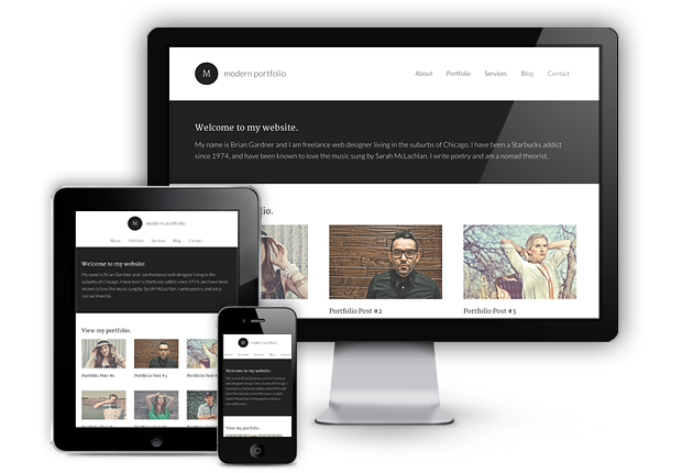
The StudioPress team has been a pioneer in responsive web design, particularly as it relates to WordPress themes.
There are now a number of Genesis child themes that feature mobile responsive design, with all remaining child themes slated to be responsive as well. (See all currently responsive Genesis themes here.)
So you know that I’m eventually going to side with the responsive web design side of the equation in this article, at least as the optimal design strategy for the majority. (Sorry to kill the suspense, if there was any.)
I recently set up a new site of my own, and I threw a responsive theme on it without hesitation because responsive web design fits the content of the site and how readers will interact with it.
But what about when responsive isn’t the right choice? Such cases are out there, and the aforementioned Mr. Meunier highlighted a few of them over at Search Engine Land.
Disney’s responsive site is one of the examples he discusses.
The site is visited often via mobile devices by people wanting to play one of the number of games they make available. Unfortunately, the games cannot be played on small screens, which is going to disappoint the 30,000 users each month who wind up on the site by searching for “Disney games” from their mobile device.
The negative SEO impact of this is obvious: a poor experience will lead to a quick bounce by mobile users. For related keywords, this will likely harm the site’s mobile SEO.
Does this mean that Disney is necessarily wrong to have gone with a responsive site? No. This example just highlights one area of the site where being responsive is not as beneficial as having a separate mobile site — for its games — might be. For all we know, going responsive has had a net positive impact on Disney.com’s SEO strategy.
The point is that there is much more to take into account when deciding if a site should be responsive than cherry-picked anecdotes suggesting an isolated negative SEO impact caused by a responsive design.
Among factors that can tilt a publisher’s decision away from responsive web design:
1. Features.
As with Disney’s videos, responsive design may not be for you if your site has features that will not be able to load without being handled by a mobile-specific site.
2. Content Relevancy.
This is rare, but do your mobile users look for a significantly different experience than desktop users? A mobile-specific site may be better if highlighting specific mobile-preferred content is necessary, as opposed to just rearranging the normal site content.
3. eCommerce.
If mobile commerce occurs frequently on your site, you may want a mobile-specific solution for browsing products as well as a shopping cart.
And now, a quick word on keywords …
The ability to target mobile-specific keywords is an oft-cited benefit of mobile-only over responsive web design. But no less an SEO expert than Greg Boser explained to me that the devil is in the details, and the details are not always as simple as the mobile-only backers make it seem.
There are so many factors beyond keyword targeting that determine how pages will rank on mobile devices … the biggest being location.
So, while having a separate mobile site that can serve up different mobile keywords for a page may be beneficial, it is far from the silver bullet many make it out to be.
The point here is to not think of this question — to deploy responsive web design or not — in terms of SEO impact first. It’s to think of it in terms of content and audience-friendliness first (which, by the way, is just good SEO … and which, ahem, is how Google wants you to do it anyway).
Think about your content and think about your readers. What’s the best way to display the content? What will your audience expect and enjoy the most? Committing to deliver the best experience possible for the greatest number of site visitors is going to be the most beneficial long-term SEO strategy.
And in most cases the way to do that is with mobile responsive web design.
When should you choose mobile responsive design?
Brian Gardner, founder of StudioPress and the man who spearheaded the initiative to begin making Genesis themes mobile responsive, believes that thinking of responsive web design as being necessarily “good” or “bad” for SEO is misguided.
The reality, as Gardner explains it, is that it’s subjective, that a site’s SEO is impacted by so much more than just the design strategy.
“Responsive design is more about readability than it is about SEO,” Gardner told me. “It is about how elements on a page are arranged and delivered to the user based on the device being used to access it.”
He summed it up this way:
What design best fits your content and your readers?
And for the majority of content creators, going with a responsive design — especially an out-of-the-box theme that is built to be responsive — is the most prudent decision.
Here’s why:
1. Cost
A mobile-specific site, or even just a series of mobile-specific URLs, may be deemed the best bet for users, and thus, for SEO. But can you afford the development cost? The answer depends on your situation. (And you better be sure that the bang for your buck will truly be there.)
What doesn’t depend on the situation is whether a responsive site will provide a better, cleaner experience for mobile users. It will. It may not be ideal in all situations, but 99 times out of 100, it will be better.
2. Convenience
Creating a mobile-specific site also takes time. If being mobile-specific is worth the cost and the time, and your content demands it, go for it. But in the absence of this specific criteria, why not spend way less to make your theme responsive in a matter of minutes?
Installing a responsive child theme on the Genesis framework will allow you to do just that.
3. Consistency
You want your content to be shared. And when it is, you want the visitors who reach your site to have the same pleasing experience the original sharer had. This is much more likely to happen with a mobile responsive design than a mobile site with separate URLs.
Consider the case of The Guardian.
One of many large media sites that probably cannot go straight responsive — because of issues like ad serving — The Guardian’s website shows the problems that can arise without proper multi-direction device detection protocols in place. (Something you don’t have to worry about with responsive design.)
If someone is reading a story on a mobile device and then shares that URL on Twitter, the mobile URL is what gets distributed. Then, when another person clicks on the link from his or her 27-inch iMac, that person will have to try and read the story on the tiny mobile layout.
Do you think that might have on impact, even if subconscious, on the reader’s willingness to stay on the page, let alone share the page again or link to it? You bet. And any factor that decreases time on site or the likelihood of social sharing and linking has a negative SEO impact. On that, we can all agree.
4. Conversion.
The heart of the entire question this post is addressing is this: do you need a separate mobile site to convert?
We covered the exceptions above; but for most of you, the answer is no.
What you need is to give your mobile users as clean and convenient an experience as your desktop users so that your content can shine and your conversion strategy can go to work. That is exactly what responsive design enables you to do.
Easily.
And at a minimal additional cost.
So … is mobile responsive design good for SEO or not?
In a word, yes.
In a few more words:
Yes, because it’s good for users. Mobile responsive design gives your audience a better mobile experience than a non-responsive design that simply serves up a bloated desktop view.
A better experience equals happy readers … which equals on-page engagement, linking, and sharing … which equals better SEO.
The only question you might need to ask is whether, in your specific case, your site fits within the minority of sites for whom a separate mobile site would bring important benefits.
Just remember to frame the question properly: ask not whether your design is good for SEO; ask whether your design is good for your content and your readers. The latter is what has the greatest impact on the former in the long run.
If you are in the small group of sites with stringent content display needs — and you’ve got a fat wallet — consider a mobile-specific site.
But if you’re like the rest of us, mobile responsive design is your best bet.
Note: Statistic about babies born vs. mobile devices activated worldwide is courtesy of lukew.com
Reader Comments (71)
My website is responsive, and to be honest, I never thought that a responsive website design could affect ones search engine rankings.
I’m glad that your post put any doubts that your title made in my mind to rest.
At the end of the day, responsive web design is all about making your website as easy to use for as many website visitors as possible.
Jakk, certainly design can affect search rankings based on how it impacts load times, time on site, sharing, etc. And you summed it up perfectly with your last sentence. The design that best fits what your visitors want and need is one that, ultimately, will be best for SEO in the long-run.
Hi,
And just as I was going to reply to your comment:
http://readwrite.com/2013/05/15/now-google-wants-to-kill-the-mobile-web
I know this is not 100% related, but still, an interesting read for anybody worried about mobile website design vs responsive.
Your thoughts Jerod?
Jakk, thanks for posting this. I think it simply confirms what we’ve been saying here at Copyblogger for a while: responsive is the design method of the future. It also suggests that Google is even more strongly in the responsive camp as the “right” way to do things. So from an SEO perspective, you’d have to assume that following their suggestion will be in a site’s long-term interest.
Depending on how the navigation is programmed, responsive mobile design CAN HURT SEO. Example: a site with 1000+ pages goes responsive. The mobile navigation allows the visitor to go from any page to any other pages, which means that all 1000+ links are in the navigation, which means that 1000+ links were just added to the code of every page. Three days later…Panda penalty. Rank crashes. Traffic drops by 30%.
Drop me a line if you’d like more details on how we mopped up the blood. 🙂
Indeed, an issue like that could hurt search rankings. But that is not responsive-specific. That could happen on any site.
Phfft. Who cares if responsive websites are SEO friendly or not. Responsive breaks down a long time before you get down to the SEO nitty-gritty.
There is so much that doesn’t work on responsive websites. Maybe you’ve seen what happens if you don’t use the right pricing chart. Pricing charts with segments that are ten or a dozen pixels wide work out so well. You’ll have the same problem with other graphic elements trying to scale down from desktop to phone size.
There are too many able mobile site builders that are also easy. For marketing on the mobile web responsive construction makes little sense.
Thanks for reading and for your comment Joelin. Poor design is poor design, responsive or otherwise. I agree that there are poor examples of responsive design out there, just as there are poor examples of mobile design (app or web) and standard desktop design. The key, of course, is to think about your customers and their experience on your site. If it’s an ecommerce site, and you need pricing charts as you’ve described, either find a good mobile solution that works…or perhaps your site needs to be mobile-specific. But I have to disagree that “for marketing on the mobile web responsive construction makes little sense.” It makes A LOT of sense for the majority of the sites.
Thanks for the post. This is something my team and I are in the process of developing for our product’s site – but more importantly, we’re working on making our product responsive as well. At the end of the day, though, I think it simply all boils down to what your audience needs and or wants.
Justin, indeed it does. 🙂
If your standard desktop website has good rankings, is it better to create a separate mobile site or to recreate the standard site using a responsive design? My concern is that I would lose rankings by switching layouts. I realize it’s more about the content than the design as it relates to SEO, but I’ve read horror stories of sites losing their high rankings after redesigning them even though the content remained the same.
Wes, whether or not you create a separate mobile site will depend on if you fit into the exception cases listed above. As for being fearful of redesigning, it’s a valid concern. But switching layouts to responsive *shouldn’t* (in the hands of a capable theme framework or developer) cause any negative impacts. Remember to keep important elements like page title, heading tags, and URL structure, etc., the same … and any possible negative impact (if there would be any) should be offset by increased user engagement, linking, and sharing, all which will boost SEO.
User intent. User intent. User intent. You really have to know who your users are, and what they’re doing on your site. My fireworks directories (I have six of them) get millions and millions of pageviews in season. Last year 49% of them were mobile – it’ll probably be more this year. Everything we do is geared towards putting the most important information front and center for the people out and about with their phones. So we were early adopters of responsive design. And it’s worked out very well.
Yes. Yes. Yes! You nailed it Meg. Give the visitors what they need and want, and they’ll return the favor.
This is a fantastic perspective on the debate, Jerod. Thanks for sharing. The only question I have is on what you meant by “location” regarding keywords:
“There are so many factors beyond keyword targeting that determine how pages will rank on mobile devices … the biggest being location.”
Which location are you referring to – geography of site traffic, placement of the keywords or something else? Could you expand a bit on this? Thanks again – great content.
Ben, excellent question! In that statement, “location” refers to physical location. Where is the mobile device that is accessing the site? Search engines have become so sophisticated at geo-targeting, and no keyword wizardy is going to trump it.
Thank you for NOT leading us all down a blind alley and providing a sound example that works. I believe I’d still like to opt in for mobile design, not be forced into it – this is why mobile browsers have scale ratios. Have you ever seen how retarded some of these mobile down OS looks where, all you see are 3 or 4 menu tabs, and a slim edge of content beneath? Sometimes you just don’t want the breakpoints and scrolls – Disney is an excellent example of a menu interface clean slide in – slide out (haven’t visited in a while) but not everyone can be Disney. Sometimes, I want to pinch and pull away, I want to fly across the screen and zoom…cant do that with one size fits all
Good points. It’s all about what works right for your content and readership.
You should be using “e.g.” instead of “i.e.” Look it up.
Great work though. I’ve finally come around and embraced responsive design. Interesting that even Google is recommending the same DOM for different devices.
Martyn, you are correct! “e.g.” is for examples, “i.e.” is for clarification. Good catch.
And yes, when Google recommends something as being preferred, it should be taken seriously for SEO … assuming it’s right for YOUR readers.
Anybody seeing the Google I/O conference? Pretty exciting stuff!
Not currently. Any highlights?
Three notable reveals were an iMessage like service for all Google platforms, A Spotify like service called Google Play “All Access” and a Game Center clone for Google Play
Interesting. I am a Spotify junkie and have never used Google Play. If anyone can present a compelling reason why the latter might be better than the former, I’m open to listening.
This is a great topic and in a lot ways I agree with you but there are definitely more reasons to not go responsive. For content marketers, which is obviously the audience here for the most part, yes responsive is a great way to go but when it comes to local businesses I would disagree.
If you’re a restaurant, salon, dentist, etc…Responsive does not serve you the way a separate mobile site does. With much of the traffic coming from local search (and on a phone) these types of businesses have a chance to convert people to action within seconds. So when we’re talking local, consider your users intent.
It’s most likely that they are not browsing…They are trying to call, make an appointment or reserveration, get directions etc. A mobile site aimed at driving that conversion is much easier to accomplish using a separate site and just as affordable as a responsive theme
As a content marketer myself, I use a responsive theme but i cover mobile marketing on my blog and podcast and have been offering mobile services to both brands and small businesses for 8+ years. I think responsive is a glimpse as to the direction we’ll want to go in the future but for now there are benefits of separate sites depending on your business type.
Also glad you brought in Bryson. I’ve had him on my podcast and he is truly a thought leader from the SEO side of things.
Oh and my responsive theme is from studiopress. 😉
Greg, you make GREAT points. I actually don’t think we disagree much at all, especially with your main point here: “consider your user’s intent.” That’s the key. And what design will best serve that intent. If a local business can afford the development of a mobile-only site, it can have benefits. If not, going with a responsive theme (like, say, oh…Genesis!) at least provides a better (even if not ideal) experience for mobile users.
And yes, Bryson’s work is terrific. As I was researching this article, I continued to come across his pieces, and they provided an outstanding alternate perspective.
I actually think that for a lot of local businesses, that’s also exactly what people want to do on their desktops or laptops. If I’m looking up a restaurant, I want to know their hours, what kind of food they serve, and where they are. What I don’t want is the dancing baloney and flash slide shows that a lot of better restaurants think their web readers are looking for.
For a local business I’d design for my mobile users first and then think hard about whether desktop/laptop users actually need anything different.
Do you have an opinion on plugins like WP Touch (free or premium)? Or even Jetpack’s Mobile option? If, for example, you didn’t have a StudioPress responsive site?
Bradley, I have no used WP Touch in at least 2-3 years on any sites, so it would be unfair for me to comment. And I haven’t used JetPack’s Mobile option. I think that if the WORDS of your site are THE main attraction, then these plugins (or at least, how I remember them working) can be beneficial in decreasing mobile load times and cutting out all excess crap. They don’t measure up to responsive, but if they will provide a cleaner, quicker experience for readers then they have merit, especially as quick, low-cost alternatives.
Good point about “the words.” Also, you mention, “quick, low-cost” alternative. Maybe a good solution is to go with one of these plugins as a Phase 1, test it out for a while, then if the audience merits it, go with a more robust options (responsive or a mobile version of the site). Thanks, Jerod!
Mobile internet use is widely predicted to exceed desktop usage within a couple of years from now, so some sort of mobile optimisation should be a serious consideration for any business.
50% of traffic is from mobile devices and tablets. This not only is this going to grow, it’s going to be come the clearly dominant form of internet use.
So its wise to make responsive website, to give user charming experience of you business. Whether its small business or large.
Great points Peter. And as Josh Byers wrote recently on Copyblogger, this is one of the reasons why designing from a mobile mindset first is so important:
https://copyblogger.com/mobile-first/
Yes.. YES.. absolutely Yes!
I would not build a site today w/o mobile responsive. Too many people are using smart phones, Kindles, ipads, etc.. and as you know, the trend is growing.. I recommend to all my new bloggers to get setup “right” with a responsive theme.
Think about it: It’s hard to read websites on a tiny iphone screen if it’s not responsive.
I just started using Genesis in the last six months.. after finally abandoning Thesis with their mess of an update. So as you mentioned, they have a large selection.. and there are even free WP responsive themes.
Oh, I almost forgot most of your article was on how the responsive themes related to SEO.. and of course I want to throw my two cents in on that, too! LOL
I am SO over Google! Yes, I still SEO, (it’s drilled into me since the SEO ninja days) but I don’t spend a lot of time trying to please them anymore. I don’t give a hoot if they ever front page me again or not. Provide for your readers and they’ll make sure your site gets plenty of traffic… well that and a few other traffic sources.
~darlene 🙂
Darlene, the irony is that immediately after saying, “I don’t spend a lot of time trying to please them anymore” you described, in a nutshell, exactly what Google wants you to do: “provide for you readers.” I would certainly not ignore Google’s recommendations for how pages should be structured, and the most important elements they look for in ranking sites, but the days of creating content “for search engines” is over. Or should be. Think reader-first, and good SEO will follow.
I hear you with: “exactly what Google wants you to do: “provide for you readers.”
But my point is that Google’s definition of “providing for readers” is a constantly moving target…. and there are waaaay too many other killer traffic sources to get bogged down with trying to plz Google.
Like I said I will always SEO but that’s only a small part of my traffic strategy now.
~ darlene
It seems to me that in the long run, any increased presence is a boon to ratings and target audience. So, in favor of a mobile presence.
I’m sick of sites that auto-redirect me from a relavent google search result to the FRONT PAGE of their mobile site.
Give readers what they want. 🙂
I’ve had a tough time trying to sell mobile websites to clients. Too many of them “think” that their desktop site is more than enough and that it looks “fine” on an Android/iPhone device.
There’s just no comparison between a mobile responsive site and its clean layout, fast loading time, lack of zooming, etc. and a desktop site that looks absolutely atrocious when viewed on a mobile device! So I will definitely agree that a mobile responsive site is better for SEO, the problem is convincing my stubborn clients the same thing!
Mike, just remember that when it comes to selling, even just an idea, you have to turn features into benefits. Clean layout, fast loading time, lack of zooming, are great features of a responsive site, but how will they (and the cost to implement them) benefit your clients?
Clean layout = increased content consumption and better conversions
Fast loading time = greater on-site engagement metrics and improved SEO
Lack of zooming = better reader experience, greater likelihood of sharing, which means more traffic, conversions, AND SEO.
And, of course, all of this should, over time, lead to recouping whatever the cost is.
Translate the features of responsive design into benefits, and you’ll be more likely to convince your clients to see things your way. (The right way!)
Thanks for the article Jerod. Been making me think, 90% of the websites we design are responsive and I have never thought about the SEO impact. Personally I like choosing my experience rather than being forced (like Amy mentioned). For example the Disney website redirected me to disney.co.za, not responsive, I would have liked to have been given the choice of .com or .co.za and same with mobile.
In South Africa we have a massive low income strong mobile (very old like WAP) market, but we usually don’t cater for them.
We mostly do smaller informational pages, is there really value to mobile specific sites for us?
FYI found your article when you knocked us number 1 for some of our keywords on http://www.google.co.za, well done!
George, thank you for being so gracious in “defeat.” I’d like to think my author Authority had something to do with it, but posting on Copyblogger provides a pretty good head start. 🙂
For smaller informational pages, I see no reason to do a separate mobile site. Why? Going responsive so that the content is clean and easy to read on mobile is more than enough. And that’s rather easily done with a framework like Genesis (if you’re on WP).
We popped back to to number 1. Thanks for the advise, I’m just trying to find the perfect strategy. In our unique market, strangely a completely legacy WAP mobile site for some mass industries might work. Will have to test.
Strangely your article has sparked more interest to me on the Authorship side than Responsive design. Thanks again
So you are back on number 1. I know this is off topic, but how can Google’s SERP be so fluid? And what have you done right today that you didn’t yesterday, as you dropped almost off page 1? Your input would be HIGHLY valued 🙂
George, I can assure that no one is doing anything proactively to influence that specific search result. Google’s results are incredibly fluid, and the results you receive for the same search can vary from one day to the next based on hundreds, perhaps thousands, of different factors. We just put great content out there, work to help it get read and spread, and then the search engine rankings fall where they may. Because the domain has so much authority, that is typically high for any topic related to copywriting, web design, etc.
Thanks Jerod, I know you aren’t, that’s why this has puzzled be so I did some digging. I first thought it was the Fresh Content you where getting through comments but then I realized it was good old backlinks. I wrote a little case study: http://www.restrive.co.za/link-networks/
Thanks, I learn soooo much from this article, about things other than responsive design. Competition is good!
Hi,
Very interesting topic. Nowadays is very important to think about mobile responviness. I am myself a heavy mobile reader.
I have one question about the Genesis framework in relation with the mobile responsiveness. If I want to built it in Genesis without using a pre-made theme, is there any documentation/tutorial about how to that?
Thank you!
The sample child theme that is available to Genesis users is also responsive. You can use that to build your own. We’ll be releasing Genesis 2.0 in the coming weeks, and the default style for it will look like this.
Hi Brian,
Oh, that’s great! Thanks for your reply. 🙂
Eye opening piece with some great tips and advice! Thanks!
Thank you Eilidh. 🙂
Hi Jerod, I think you raised a very interesting topic which I havent notice until today, As an usual mobile readers, I think it worth for investing for a mobile responsive website since I think the visual look and interface of some websites on PC can hardly fit the size of mobile users. I am using a 5inch mobile but I prefer websites are designed to let user have the best experience.I think your advices are what businesses need now. Thanks for sharing.
Mobile is the future!
And the future is now!
Absolutely Helen. That’s the “rub,” if you will, of this piece. To truly design for SEO, put the users/readers of your site first as opposed to the search engines.
Nice article. The question what would Google do ( or better yet does ) is interesting. Their best practices as you pointed out was serve the same HTML using CSS media queries for particular devices.
This works well for Google mainly because their base UI is lean and sparse it is almost as if their laptop and desktop web interface were designed for mobile devices from the beginning of time.
In my experienced most sites owners / designers do not want that spartan of an interface for their base look.
The problem with most responsive designs is the base design is for the larger screens and the all important conversion rate drops dramatically when you responsively resize the page down to a mobile device.
It is almost as if you should have a base design for a mobile device and then size up to really be affective with the mobile device – unless you start with the clean look that Google provides on most of its web properties.
We have found that for many SMB sites it is a better ROI to have separate HTML5 site for mobile devices and create the main site responsively with the base CSS designed for a tablet in landscape mode.
Sure you have two code bases you must maintain but if the mobile site is relatively small in size and you give the user the ability to go from mobile to main site, you solve a lot of issues. The most important is the ability to fine tune your mobile site for better conversion rates.
We agree with you: Three Reasons a Mobile-First Philosophy is Critical For Achieving Your Business Goals
Wouldn’t having a mobile version of a site generate additional load on our server ?
I agree mobile is the future, and that is where we should be focused on. Thanks for sharing!
I’ve been recently reading all these buzz about responsive design, but no matter .. I think ‘Less is More’ when it comes to creating that seamless experience your user/audience craves, especially in the age of multiple devices. While having an optimal viewing experience can up your chances of visitors staying more on your site and lessening bounce rate, there is still no guarantee that they will convert into customers. What is the perfect mix then to make sure that happens? I believe it’s a mix of various factors that will come into play.
Great read, thank you Jerod, it really is amazing how many mobile visitors websites are receiving, yet still some companies do not see the benefit of making life easier on their mobile visitors by changing to a mobile friendly website. It is amazing when you do a long term report on google analytics and see the dramatic growth of visitors coming from mobile devices.
The starting point for deciding between responsive design and mobile-specific should always be “What is a typical mobile visitor looking for when they reach my site?”.
From this point of view, sometimes responsive is best, other times mobile-specific is best. In making this evaluation, it’s helpful to note the benefits and drawbacks of both approaches and then evaluate them from the perspective of the visitor (not the site owner!).
Starting from any other perspective (such as design, cost, time etc.) can end up costing a business more in the long run.
Are you also going to be doing a responsive theme for Agentpress?
Isabella, great question. The theme for Copyblogger’s Agent Press program, Hyperlocal, is responsive. The AgentPress child theme (http://demo.studiopress.com/agentpress/) will be getting upgraded to be responsive in the future.
If you use Google analytics or anything else to track traffic, you’ll notice the portion that shows where your traffic is coming from. If you don’t tap into mobile responsive sites, you’ll eliminate nearly 30% of traffic, I promise. People don’t want to deal with a non-mobile responsive site when they’re on their mobile device.
Long time fan of copyblogger and medium techy. My question may be giving away my ignorance regarding responsive design. I’m using the Magazine child theme which is responsive at its base but, of course, I’ve fiddled around with it.
Indeed, I’ve added a large picture on the Home Page (not good) and changed the logo text etc. None of the SoYouWantAChange web pages are responsive when I submit them to the test in http://www.studiopress.com/responsive.
What must one do, or not do, for an original responsive child theme to stay responsive? Or, in other words, what breaks its responsiveness?
My site is responsive however when I run page speed it recommends serving scaled images!! Well if it’s responsive and that’s what they recommend how does one over come this issue?
Based on the screen size, images are sent in different sizes to the browser, this is causing other sites with non-responsive themes to rank higher (keyword stuffed posts too) with some keywords that I used to rank well with. This is certainly baffling for me. Can anyone shed any light?
What a great article. I’ve been self-learning web design for the last year, therefore have read many articles online, and must say that this article is one of the best worded.
In fact, everything about it from font style, colour, layout, and content is tip top! Thanks Jerod Morris .
Since last few months i was emphasizing too much on having a responsive layout, finally i got one. Now after reading this post, it makes me wonder have i done the the right thing.
The upward traffic trends is showing that i have made the right decision. Since i have noticed that CopyBlogger is also responsive, i think i am gonna stay with responsive for a while.
You made the right decision.
This article's comments are closed.